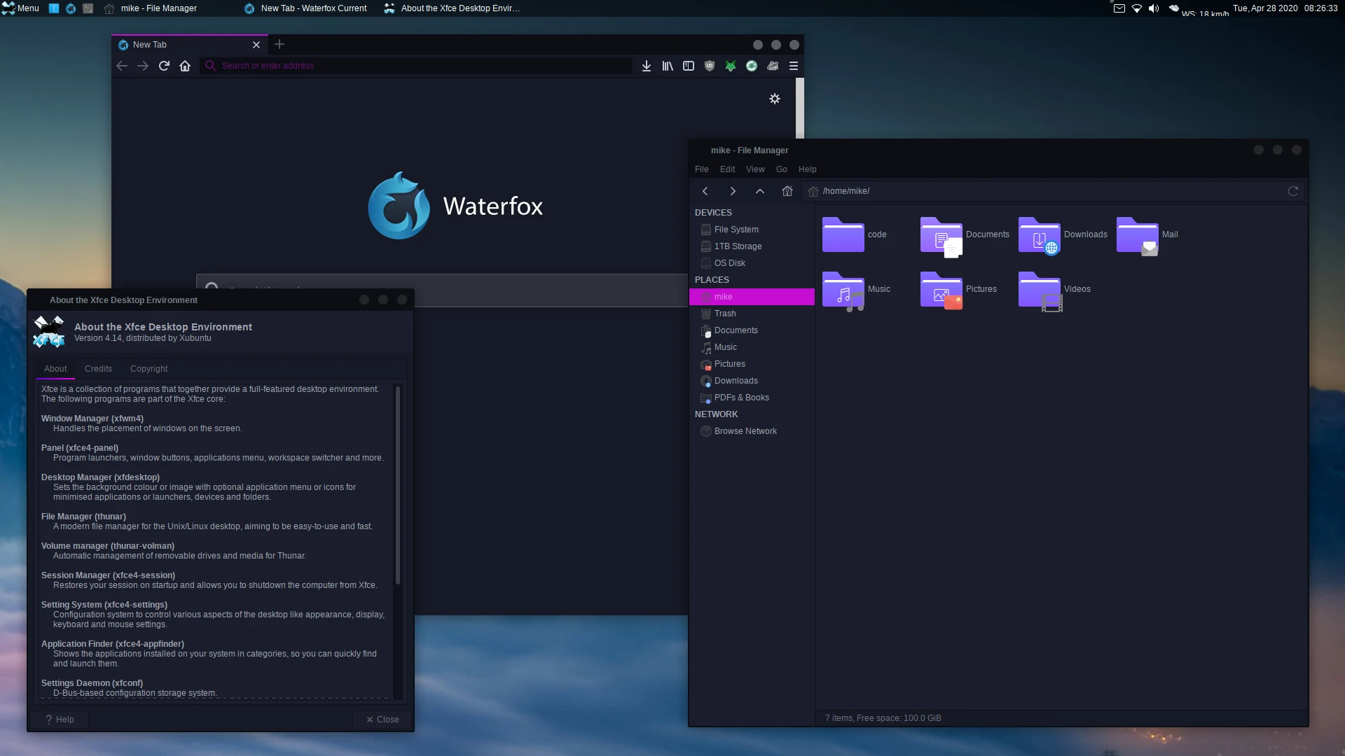
Around this time last year (a bit earlier actually—October or so), I decided to make the switch to using a Linux distribution as my daily driver (while also dual-booting Windows). Just like everyone else, I distrohopped until I found the distro that I felt was “just right”. I settled on Xubuntu—a nice flavour of Ubuntu that runs the good ol’ XFCE4 desktop environment. It just seemed like a nice, fairly snappy operating system. Below is a screenshot of what my system looked like from about April to around last week:

It looked nice and all for a while, but recently I was getting sick of it. I decided it was time to change it up a bit; I decided to try out Arch
I had used Arch Linux for the past year or so on an old laptop of mine (this same laptop is where I had installed Ubuntu for the first time years ago!). I had played around with Arch occasionally, and I thought it seemed like a really cool and extensible distribution. I felt like I had loads more flexibility, and that I knew the system better because I had installed everything on it myself from the ground-up.
So, last weekend I got my desktop prepared for a new install of Arch (cleaned up file/directory structure) and put the ISO on a trusty USB. I went ahead with the install—it took me two attempts ‘till I got a functioning system. It seemed like the latest 5.9 kernel just doesn’t like my hardware or something. The second time around I went with the LTS kernel, and all went well.
I booted into my new system, and installed whatever essential packages I needed (i.e. Neovim, etc). I had decided beforehand that I’d go with Openbox as my window manager, so that’s what I installed and ran initially. I had played around with it, got the basic things configured. However, I soon discovered that Openbox does not have the ability to “hide window contents while dragging windows” (see here, things haven’t changed since then apparently). It’s a really small feature, but something I really wanted to have, as it just makes the system feel a lot snappier. Nevertheless, I discovered quickly that the Fluxbox window manager actually supports this feature. I had basically never used Fluxbox before (maybe once or twice as a test), but decided to give it a shot anyway. And boy, I’m glad I did! Fluxbox’s man pages are pretty comprehensive (thankfully, as there isn’t much online resources unfortunately), so I was able to get it configured fairly quickly. I was very impressed with how customisable and simple Fluxbox actually is. It was basically just what I had been looking for. I was able to adjust it to suit my workflow, using some keybinds such as the following:
# Close window
Mod4 Q :Close
# Make window fullscreen
Mod1 F11 :Fullscreen
# Tile window vertically to the left/right.
Mod4 Left :MacroCmd {ResizeTo 50% 100%} {MoveTo 0% 0% TopLeft}
Mod4 Right :MacroCmd {ResizeTo 50% 100%} {MoveTo 0% 0% TopRight}
# Maximise window
Mod4 Up :Maximize
# Restore window if maximised, minimise it if restored.
# The call to 'Maximize' here is a hack that is used to actually
# 'Restore' the maximised window, since there doesn't seem to be
# any 'Restore' command (at least not in the build of Fluxbox
# that is in the Arch repos).
Mod4 Down :If {Matches (Maximized=yes)} {Maximize} {Minimize}
# Launch script that moves window to other monitor:
# See my dotfiles for the script, I can't find the original author:
# https://github.com/mikejzx/dotfiles
Mod1 Shift N :Exec $HOME/src/scripts/misc/move-to-next-monitor.sh
# A pretty cool command that tiles windows in master/slave format.
Mod4 A :If {Matches (Layer!=Desktop)} {ArrangeWindowsStackRight (Name!=tint2)}
# Launch Rofi to search for programs.
Mod4 S :Exec rofi -show combi -combi-modi "drun,run" -modi combi
Those are the main window management keybinds that I’m using, and they get the job done great. I haven’t tinkered with workspaces yet, since they seem a bit awkward to use on a dual-monitor setup with a floating window manager. Maybe in future I’ll try work something out.
After getting Fluxbox (and everything else on the system) configured, it was time to theme the damn thing! I had initially been using the ’bloe’ theme that came with Fluxbox, since I thought it actually looked decent, and sort of retro-ey. Thing is, I just wanted a dark version of it!
Well, I decided to go ahead and make my own dark version of it. I mean, it took some tweaking, but eventually I was able to get something that I was actually pleased with. I only ended up editing the pixmaps that I was actually using, so that is—close/restore/minimise buttons, window titlebars, etc.
I had to find a GTK theme that went well the Fluxbox theme. Man, it was a pain in the ass, but I did eventually discover a theme called ‘Vertex’, which I think worked well with it. I did just slightly modify the colours of the toolbar/window menus of GTK2 windows, and also removed all ’transitions’ that I could find—since I don’t like them very much.
Finally, I had to get my panel configured. I had installed Tint2 pretty early on, while I was experimenting with Openbox, and yeah it’s pretty awesome. I was able to configure it pretty much just how I wanted. The other day I even put this crazy gradient on it, which when paired with a blur effect (thanks to Tryone144’s fork of the Picom compositor), made it look a bit like the Windows Vista taskbar. I mean, I wasn’t trying to mimick it really, but I think it goes quite well with the rest of the theme. I guess it can be considered a bit of a “retro” look now, since interfaces haven’t had that sort of thing in years. Here’s the gradient I used to achieve it:
gradient = vertical
start_color = #404040 55
color_stop = 50.000000 #4a4a4a 55
color_stop = 52.000000 #0c0c0c 30
color_stop = 93.000000 #0a0a0a 30
color_stop = 94.000000 #ffffff 10
color_stop = 96.000000 #ffffff 10
color_stop = 98.000000 #000000 100
end_color = #000000 100
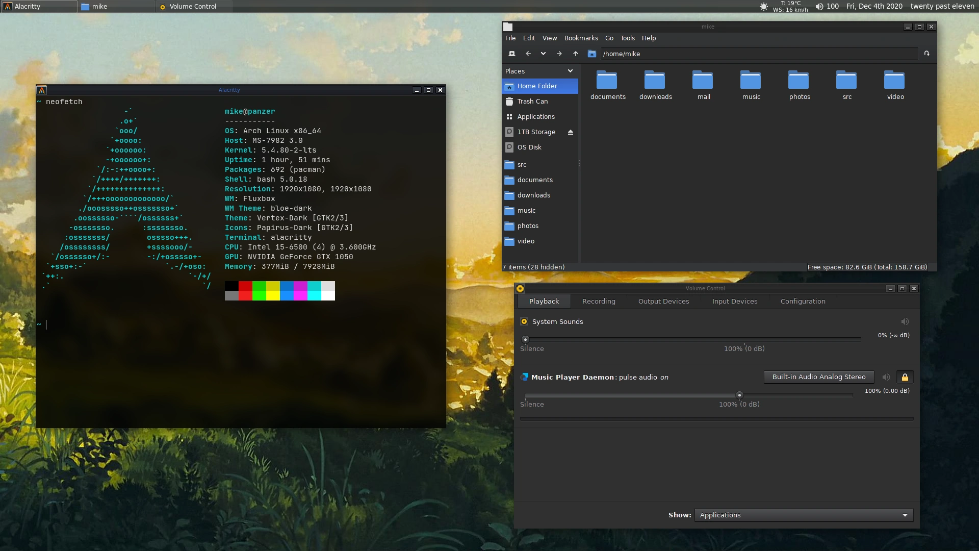
And here’s the resulting desktop. A bit of a throwback to the late 2000s days of computing I guess. It definitely won’t suit everyone’s tastes, but it suits mine!

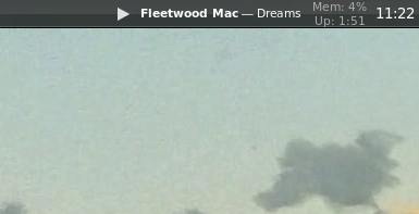
Oh, and I just thought this was really cool too—this is from the Tint2 panel on my left monitor. Got a nice MPD status display there with a play/pause icon! Of course clicking it also runs ‘mpc toggle‘.
